Walk Away

Sometimes you just have to do a quickie. This is a small (8″ x 10″) scratchboard of a zebra from one of my Africa trips. Simple process, do the drawing, remove all of the ink from the white stripes with a fibreglass brush so you are back to pure black and white, then use an airbrush (or use a large watercolour brush) to add a layer of diluted Indian ink over the whole thing, wait til it dries and use the fibreglass brush again to pull out some highlights. Repeat the ‘pushing and pulling’ process of airbrush and highlights until you have the desired 3D roundness you need to make the zebra look like you want it to look.

My photo of it has caught some glare here and there unfortunately but you get the idea.

New article by me in Artists’ Palette magazine

Artists’ Palette magazine is an excellent source of inspiration so it’s a great honour to be included in the edition currently in the shops, issue #105. I have sixteen artworks published plus a demonstration of a zebra scratchboard. Also, there are four artworks by my dad in there. He was a huge inspiration to me and, despite losing him when I was thirteen, he showed me the way in life. His art was gorgeous and always represented those African animals that he loved so much. Below are a couple of pages from the magazine article including the page with the four pieces my dad did.

Below is the start of the demo of “Wall of Stripes”

If you go to the menu above, “About Me” and then “Publications”, I will be putting up a montage of the whole article.

Happy New Year to you all 🙂

Reach out and touch the world

I’ve been reading quite a lot about ‘legacy’ recently. You know the stuff – what legacy are you going to leave the world? Sometimes it’s hard to read, especially if you think you aren’t leaving much behind, and we all probably think that way, me included.

So it’s been with great delight that I’ve watched the International Society of Scratchboard Artists take shape. In a way I can claim a small part of this as a legacy item.

About a year or so ago, I was hearing a lot of scratchboard artists complain that there was never any category for us to enter our art into in exhibitions and competitions around the world. We were always lumped in with something else like ‘works on paper’ or ‘paintings’ or ‘drawing’, and even occasionally told that scratchboard would be better off being entered into a craft show. Now I’m not having a go at crafts here but scratchboard needed to take its rightful place as a fine art medium.

I spent a short time thinking about this problem and about one hour writing a basic manifesto of why we should create a society. That was it. I had no idea how to start from that point, other than asking people for help.

Well, what happened next? Stacks of scratchboard artists agreed with me and a group of seven from around the world put their hands up to help me do the donkey work. This involved some very clever artists writing by-laws, a policy manual, setting up a website, working out levels and fee structures, getting the whole thing incorporated and pursuing non profit status, organizing bank accounts and writing newsletters.

What has happened as a result? Well, we have a whole host of members now. This is not a Facebook group which you can join, or someone joins you without even asking you (grrr), this is serious! This involves someone applying, paying money and being juried into the society. We also have an exhibition venue and date for 2012 which is very exciting. It will be at the Arthouse Gallery in Glen Ellen, California. The show opening will be July 7, 2012. This is in the heart of wine country in California and I will be making the trip from Australia for this with my family.

So how did all this happen? The people who really made all this happen were Lorna Hannett our president, Cathy Sheeter our exhibition director, Ken Mcfarlane the man who made the lawyers bend over backwards for us, Sue Rhodes our webmaster, Sandra Willard our secretary, and Diana Lee who pulled off the coup of locating our inaugural exhibition and who has promised to show me around her home state (I never forget a promise hint hint). Also Natalie Langkopf edited the first issue of our member newsletter and it was an absolute ripper! All of these good people have volunteered hours and hours of time, effort and passion, along with being fine artists themselves.

So, if you have a chance, come along to the exhibition. If I’m flying in from Australia, anyone can get there from anywhere. Better still, apply to be a member and then have a go at exhibiting in the show.

Either way, think about your own legacy. Every little, or big, thing you do is part of your legacy. Who do you touch?

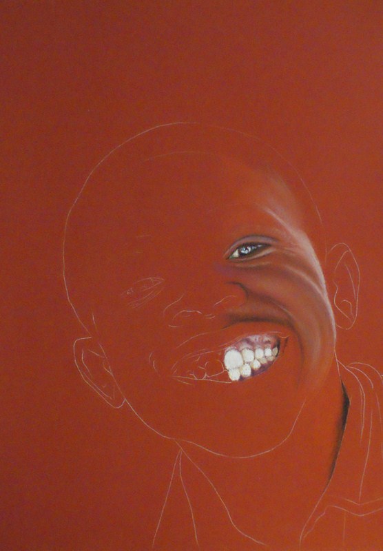
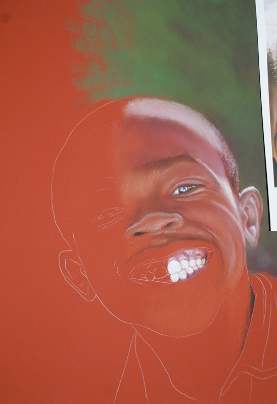
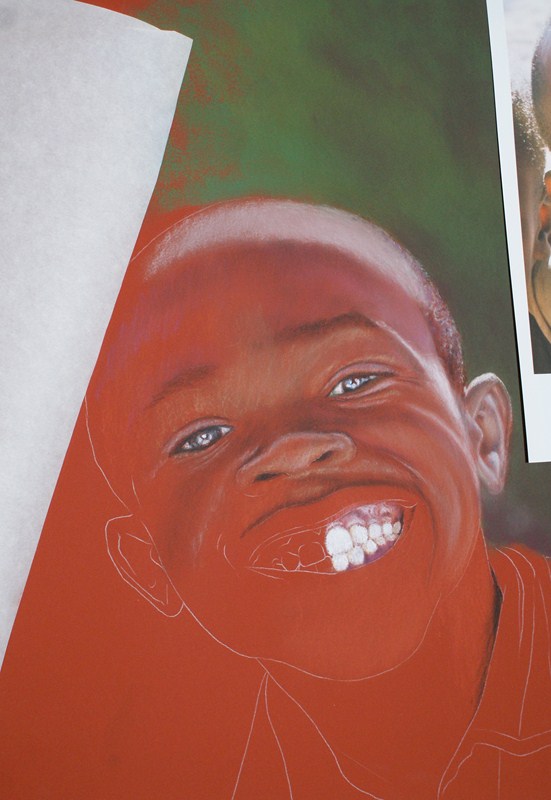
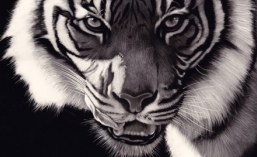
This article below was published in the November edition of Fine Art and Decorative Painting magazine. One of our master scratchboard artists Judith Edwards-White wrote the article and it contains one of her images, one of our president’s (Lorna) and one of Diana’s, and also includes two of mine (though technically ten, since “The Birdy Bunch” is a montage of nine individual scratchboards).

Toothy Grin

Last month I was honoured to be flown up to Brisbane to do a demonstration of my pastel portrait technique. My hosts were the great people at Discount Art Warehouse and I had two hours to work on this portrait of a boy from Namibia. I call it “Toothy Grin”

I started it before I went and built up a portion of the right hand side (being left handed and not wanting to smudge, I generally work this way).

This next one is where it was when I took it to Brisbane, cradling it carefully in my lap on the plane.

And now I started working in front of 29 people. I must admit, I like things like this to be interactive and the crowd was brilliant. They asked excellent questions and generally had fun which made the two hours go extremely quickly. It was free for them and I was very surprised to see that almost all of them were still there at the end.

I explained how I work from a grid which I create in an editing program (in this case ‘Gimp’, image editing software) and then draw an actual grid on a piece of paper the same size as the pastel paper I will eventually use. After drawing the main features of the boy I then transfer this to my Art Spectrum Colourfix pastel paper with the aid of white transfer paper.

I talked about choosing colours to work on. Here, the boy has beautifully rich skin and a Terra Cotta base is a really good choice. I can then allow this colour to do a lot of the work for me.

As you can see, despite working from right to left, I also use paper to stop my hand from smudging.

That’s where I finished in Brisbane. Time was up and I’ve been flat out for the last month on other things but finally found some time to get back to it. Sorry to the folks who attended for the delay but the next steps take it to completion.

What you can’t see so well here is that I actually go over the Terra Cotta colour with a Terra Cotta coloured pastel to create a ‘base’ for me to work on. For some reason, this seems to work with me. I seem to be able to blend the colours better and get the results I want. I do a lot of finger blending and Art Spectrum’s Colourfix paper is perfect for this, being a sanded finish. It’s rough on the fingers but I just tell myself to ‘toughen up’!

I’m using a background that is dark behind the light part of his head and light behind the dark part. I’ve also taken him out of the schoolyard where I met him because the background was ugly.

I’ve used pastel sticks (mostly Rembrandts but I’m not picky) for the background and pastel pencils for the boy.

And finally the finished portrait

I like to work with people who exude character. In this case, this kid was simply begging to be painted and I hope I’ve done him justice.

Finally, a big thank you not only to Discount Art Warehouse but also to Maureen, who I had just met at the demo, and her husband Lexi who took me back to the airport in a massive thunderstorm. Great people!!

And finally, funny story. I had a box of pastels in my hand luggage. Naturally these went though the x-ray machine at the airport. The guy checking them seriously had me open the box to check that they weren’t bullets! I mean seriously – do these look like bullets?? (I’ve tried to replicate an x-ray in ‘Gimp’ editing software). I guess I must look a bit dodgy!

President’s Award and Most Popular Piece 2011

I have to admit I am totally surprised and extremely pleased to have won The President’s Award for 2011 in the Wildlife Art Society of Australasia. It’s even more amazing considering the wealth of talent and superb art entered into the same shows I was in. I also won ‘Most Popular’ piece at the Bundoora Historic Homestead “The Art of Wildlife” show for my montage of emus, “The Birdy Bunch” pictured below. This was a fun piece to work on, finding such different ‘personalities’ in emus without turning them into caricatures, but simply showing them as they are in their many guises. It was also fun gathering reference material whilst constantly feeling they would peck my eyes out!