I’ve often been told that I seem to be able to show the ‘soul’ of my subjects through my art and though I’ve never really known why this is so, I thought it might be useful for anyone reading, and also myself, to put down in this blog my thoughts on how I come about creating an image, whichever medium I use.
1. Generally I work from my own references, photographs and experiences collected from my travels around the world. I prefer this as it becomes more personal. I understand that not everyone has had the ability to go and get all their own reference material but it is something I encourage you to try to do. It’s certainly worth it in the long run.
Himba lady from Namibia.

2. I never create a piece of art unless I am personally and emotionally touched by the subject. I will not accept a commission unless I feel like I can immerse my own personality into it. If someone gives me a photograph of their dog and tells me that they want that animal copied, if that photograph doesn’t resonate with me, I will reject the commission. Here’s one I did where the owner sent me a few photos of her champion Collie and I did this commission because she had spent time getting great references and I absolutely adored the dog called Derby

3 Composition. I recently received a commission to do a scratchboard of two lovely daschunds. Although the owner had some very nice photographs, I knew I had to go and meet the dogs and get my own material. I immediately loved the hairy little animals and snapped as many photos as I could. I choose two photographs and edited them into a pleasing composition to come up with the art. One dog cooperated but the other one was camera shy. I managed to get a photo of her hiding behind the owner’s legs and edited that so that it looks like she was sitting behind the other dog. The dog on our right had to be adjusted for light source obviously and I feel that the image was successful

More on composition and content. I try to use the rules of thirds. That means I put the points of interest on one of the thirds in the picture. If you see a great photograph of a beach scene, you will never see the horizon, or the palm tree, in the middle. If you did, it simply wouldn’t be a great photograph. Let me illustrate my point. Which of the following two pictures is the best?


You will notice on the left (the correct choice I hope) the main points of interest are more or less on thirds. On the left hand vertical third is the bulky shape that is a combination of me and a tree. Nearly on the right hand vertical third is a boat to add interest. On the top horizontal third is the headland and on the bottom horizontal third is the beach/waterline. The water/sky line is close to the halfway point which would be wrong but is not important here because of a) the similar colours of the sky and water and b) the dominance of the headland, which is on the third. Obviously in the right picture, my cropping has ruined many of the aesthetics. All the bulk is in the middle which does not create a harmonious image.
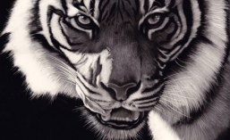
So, extending this theory, let’s look at a closeup of a lion’s eye.

The eye is the focal interest and is on not only the horizontal third, but also the vertical. If you take it further and remove all the fur, you will notice that the eye itself holds these compositional elements with the pupil and reflection on the third.
4. Looking ‘in’ versus looking ‘out’. Most (but not all) of the time you will want to have your subject looking ‘in’ to the picture. In the beach photo I’m on the left looking towards the right. If I was on the left looking to the left, I would be looking ‘out’ of the picture and this would make it less of a settled and harmonious image. I’ve followed this rule with the following picture of my wife’s favourite singer leonard Cohen.

The reason this rule works is it gives the subject some space in front of him/her/it. However, as I said before, it’s not an absolute rule and can be used to your advantage. If you change things around, you can create some tension. I’m going to borrow from my mate Leigh Rust. His image below of a meerkat ‘looking out’ of the picture makes you immediately think not only is the meerkat on the lookout, but that it has perhaps spotted a predator just outside the frame leaving you to guess what has been seen.

Leigh is a fabulous artist. Check his work out on the internet
5. Emotion. People relate to emotion and if you can find some way to include some, you are well on your way to a winning image. The following piece is of a gorilla and is titled “Why?” It’s dangerous to anthropomorphise animals. We often look at a dog and think it is smiling when it’s not. The gorilla is probably calling to mate or may simply be getting ready to stretch, but the pose is perfect to make it seem like the gorilla is asking the question “Why? Why are humans destroying us at such an alarming rate?” This piece of mine has been donated to a group of lawyers who advocate the rights of animals. You will notice I’m following my compositional rules too.

6. Eyes are undoubtably the focal points in most of my pieces. They are known as the ‘windows to our soul’ and can be vital in art. Basically, if you get the eyes wrong, no matter how brilliant your work may be on the rest of the art, you may as well throw the piece away. Badly drawn or misaligned eyes will draw attention and the viewer will move on quickly. If you get the eyes right, there’s a fair chance your image can be very special. Spend time on them because it’s worth it.

There are many more elements to creating a winning image but these are some very important basics to remember every time you put pencil to paper, or brush to canvas (or knife to scratchboard).

Beautiful Paintings