An award and some new art

It’s that time of year again for the International Society of Scratchboard Artists to hold their annual exhibition, this time in Maryland USA. I sent two pieces over from Australia, entered into the Masters category and am delighted to say that for the second year running I won the “Silver Award”, this time with my Meerkat Montage, below.

Meerkat Montage

Meerkat Montage

This is a real honour because I am exhibiting next to some of the world’s greatest scratchboard artists – in fact some of the finest artists in the world full stop. It’s always a great show for the public and artists alike. I attended the 2012 show in California where artists gave workshops and demonstrations and I certainly learnt a lot.

In this post I’m adding a few pieces of recent art below, both pastels and scratchboards.

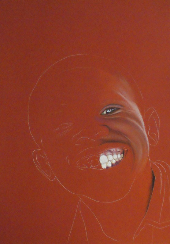
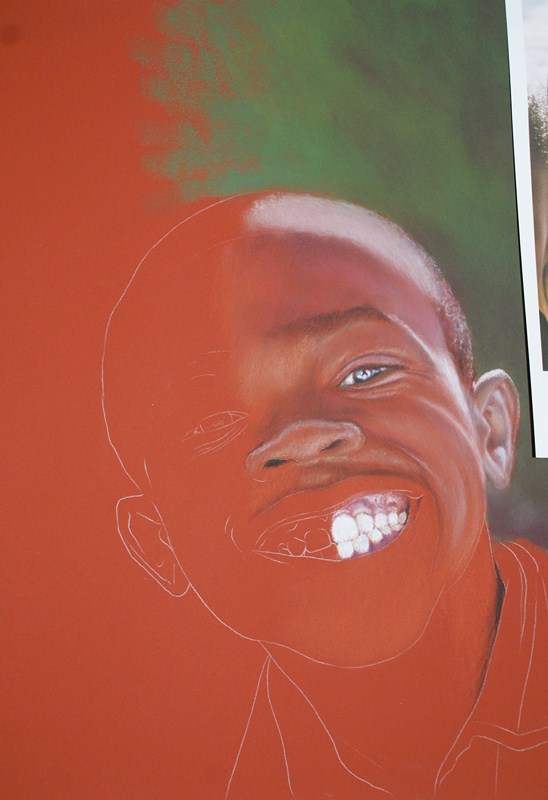
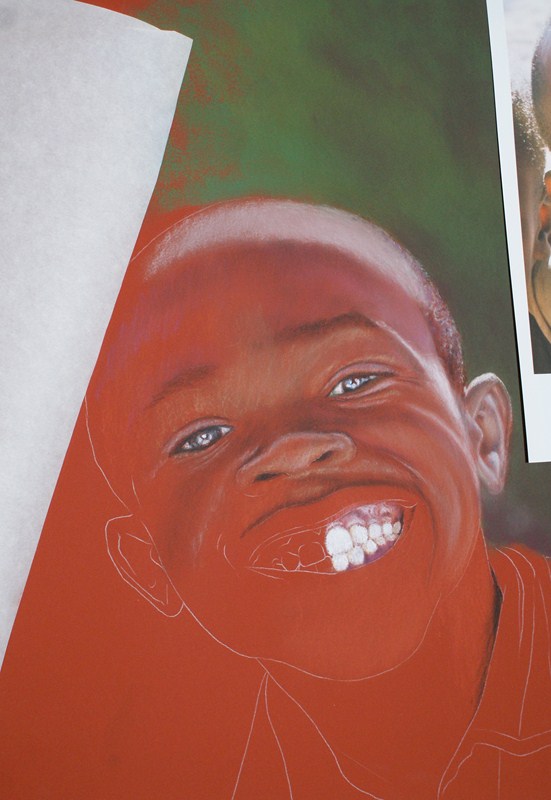
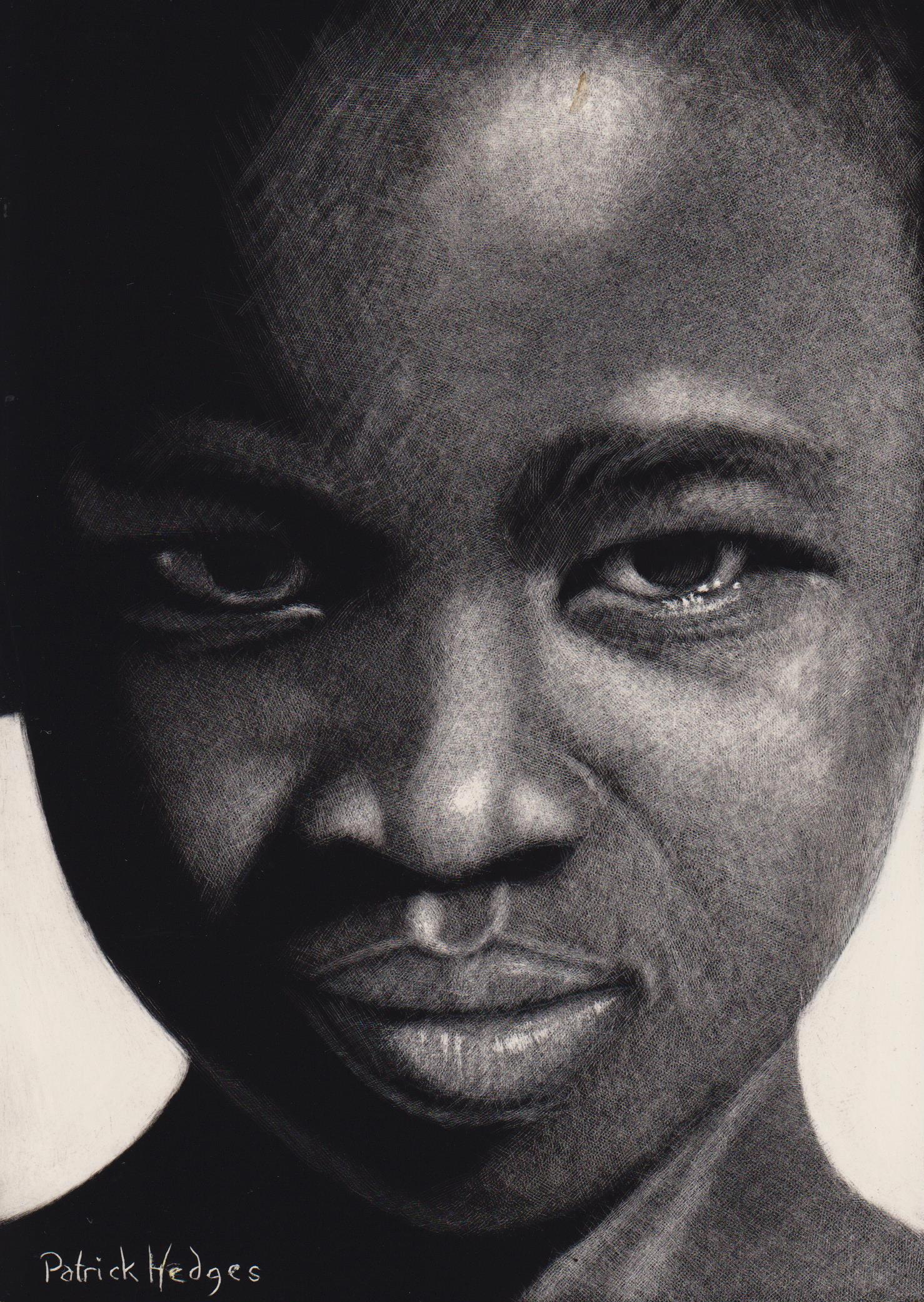
This first scratchboard of a Namibian girl (from one of my trips to Africa) is completed entirely with the use of tattoo needles.

Intensity, Namibian Girl

Here we have a meerkat created with an airbrush and the fibreglass brush I use so much, a great tool for creating a soft look. I was particularly drawn to the backlighting from one of my photographs of meerkats at the Adelaide Zoo. I started out with a white board. Normally I use black boards where black India ink has been sprayed onto the clay by the manufacturer but you can also buy clayboards where you put the ink on yourself.

Meerkat Sunset Sentry

Perhaps an unusual subject for me, done again with tattoo needles. It was a birthday present for my bodybuilder son and is of Shawn Ray, one of the world’s best ever bodybuilders.

Shawn Ray

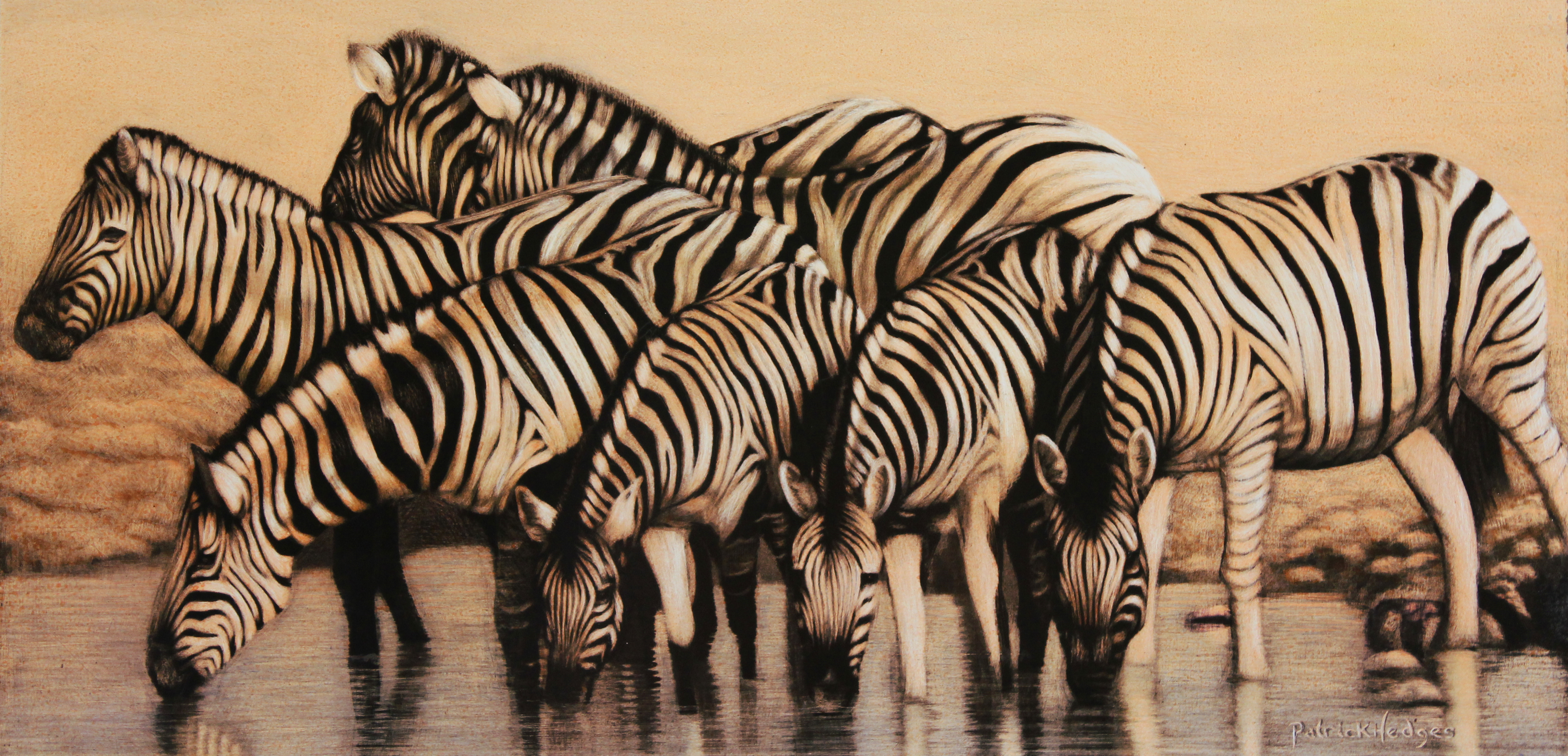
With this group of zebras in scratchboard, I’ve tried to use composition as a tool to tell a story. I’ve cropped them closely and called it “Our world is closing in” in reference to the fact that, even in Africa, the game parks are being encroached on by such massive human population growth that even relatively common animals like zebras are being driven further and further away to escape those pressures. The zebras are drinking in a formation where they can still see the dangers around them which can be an analogy for this world that they are being forced to live in.

Zebras, Our world is closing in

This is a pastel of a backlit zebra and following that a pastel of a meerkat, both quick studies for larger works to come later.

Zebra Backlit

Meerkat cutie

Toothy Grin

Last month I was honoured to be flown up to Brisbane to do a demonstration of my pastel portrait technique. My hosts were the great people at Discount Art Warehouse and I had two hours to work on this portrait of a boy from Namibia. I call it “Toothy Grin”

I started it before I went and built up a portion of the right hand side (being left handed and not wanting to smudge, I generally work this way).

This next one is where it was when I took it to Brisbane, cradling it carefully in my lap on the plane.

And now I started working in front of 29 people. I must admit, I like things like this to be interactive and the crowd was brilliant. They asked excellent questions and generally had fun which made the two hours go extremely quickly. It was free for them and I was very surprised to see that almost all of them were still there at the end.

I explained how I work from a grid which I create in an editing program (in this case ‘Gimp’, image editing software) and then draw an actual grid on a piece of paper the same size as the pastel paper I will eventually use. After drawing the main features of the boy I then transfer this to my Art Spectrum Colourfix pastel paper with the aid of white transfer paper.

I talked about choosing colours to work on. Here, the boy has beautifully rich skin and a Terra Cotta base is a really good choice. I can then allow this colour to do a lot of the work for me.

As you can see, despite working from right to left, I also use paper to stop my hand from smudging.

That’s where I finished in Brisbane. Time was up and I’ve been flat out for the last month on other things but finally found some time to get back to it. Sorry to the folks who attended for the delay but the next steps take it to completion.

What you can’t see so well here is that I actually go over the Terra Cotta colour with a Terra Cotta coloured pastel to create a ‘base’ for me to work on. For some reason, this seems to work with me. I seem to be able to blend the colours better and get the results I want. I do a lot of finger blending and Art Spectrum’s Colourfix paper is perfect for this, being a sanded finish. It’s rough on the fingers but I just tell myself to ‘toughen up’!

I’m using a background that is dark behind the light part of his head and light behind the dark part. I’ve also taken him out of the schoolyard where I met him because the background was ugly.

I’ve used pastel sticks (mostly Rembrandts but I’m not picky) for the background and pastel pencils for the boy.

And finally the finished portrait

I like to work with people who exude character. In this case, this kid was simply begging to be painted and I hope I’ve done him justice.

Finally, a big thank you not only to Discount Art Warehouse but also to Maureen, who I had just met at the demo, and her husband Lexi who took me back to the airport in a massive thunderstorm. Great people!!

And finally, funny story. I had a box of pastels in my hand luggage. Naturally these went though the x-ray machine at the airport. The guy checking them seriously had me open the box to check that they weren’t bullets! I mean seriously – do these look like bullets?? (I’ve tried to replicate an x-ray in ‘Gimp’ editing software). I guess I must look a bit dodgy!

“African Future” – work in Progress

Here’s a small kid I came across in Namibia some months ago. Whenever I do a portrait of my choice (in other words, not a commission), I make certain I have a reason for doing it. In this case, it was the boy’s expression which shouted “paint me”.

I’m using Art Spectrum Colourfix, Terra Cotta colour which will help the skin really come to life. I’ve done my gridded drawing on a separate sheet of paper and then transferred it to the colourfix. I’m working mostly with Conte pastel pencils and a few assorted pastel sticks. The sixe is 18″ x 12″

These two shots show some of the colours I’ve been using, first in the eyes and then around the mouth area.

And this is where I am up to now

Pastel portrait in stages

A couple of years ago I did the following portrait and kept a record of different stages, so here are some of those stages as I went along. I used Art Spectrum’s aubergine coloured Colourfix, a sanded pastel paper about 19″ x 15″. I chose this colour as I felt it was fairly close to many of the tones in her skin. If you get the colour of the paper you are working on correct, you can save yourself a lot of headaches. I remember once getting the colour choice wrong and it was a nightmare to try and save my portrait. In fact, I should have thrown it out and started again, so you live and learn.

This is the finished portrait and I think I got the choice of paper correct. Colourfix has a sandpaper finish to it so it has a lot of ‘tooth’ (which means it’s quite rough) and holds a lot of pastel which means you can work in layers and you can blend or not blend to get different effects. I often blend with my fingers but it can remove a few layers of skin. I guess, like a weightlifter or a gymnast, you develope tough skin.

Here’s a closeup of her eyes. I feel that if you can get the eyes right, you go a long towards a very nice portrait. If you get them wrong, no matter how good the rest of it is, you might as well throw it away.

Eyes speak to people and I concentrate heavily on them so that a story can be told through them. It may be in the wetness around the lids, or the bags and creases, or a  rheumy  colour to the whites of the eyes. Observe carefully what you see.

If I’m working from a photograph I start out with a grid which I erase as I go. The grid helps me to stay accurate. I keep my drawing fairly basic and work in the detail with the pastels using soft sticks and pastel pencils.

I seem to think that my work goes through ugly stages as I try to bring things together at the end. This is because I work some areas to completion, other areas only a tiny bit and some areas not at all until later. In the first few pictures you will notice this kind of progression.

I also have a couple of ways I approach the eyes. Sometimes I’ll do them early because this does two things, i) it gives you a ‘win’ early on and keeps your interest up as your picture, if the eyes are good, will always look pretty decent and ii) you’ll know that if you’ve done a good job on the eyes, any further work won’t be wasted. The other way I do them is leave them til the end. This is for my own satisfaction, seeing the portrait come together right at the end which can be fun. However, the danger here is that eyes can be hard to do and easy to get wrong. If you’ve worked for a long time on a portrait and then can’t get the eyes right, you may feel like you’ve wasted a lot of work. The trick to that one is to be confident and simply expect yourself to always be able to get them correct, or to fix anything that may be wrong. Art is often about confidence.

I continue working my way from right to left. I’m a left hander and since pastels are easily smudged, I work from right to left – even though I put paper over my art and rest my arm on that, I still want to eliminate as many ways of smudging the art as possible.

At this stage I’m simply finishing off the hat and then adding details and pulling things together

And finally we are back with the finished portrait. The main differences from the last stage to completion (other than the hat) are toning down what was too harsh a shadow on the left hand side of her face (on our right), and I’ve added a lot more sunshine colour to her cheeks to warm things up a bit, and that way I can play the warm tones in her face against the cool tones in the background. I’m also careful to make the shadows ‘add’ to the image. Rather than them simply being darker versions of the rest of the skin, shadows nearly always contain reflected light so since I have a lot of purples and greens in the background, I’ve used these colours in the shadows. It’s a way to make your portraits more interesting and real

Here’s another portrait of someone we met in Malawi which shows how reflected colours in the shadows can help.