New Oil Painting Portrait

Gee this oil painting stuff is hard work! Some people seem to make it look so easy but I guess when you are used to pastels and knives (for scratchboards), brushes act like alien implements. They seem to want to go where they choose, not where I choose, but bit by bit I’m getting there. I refuse to be beaten.

This is a girl from Spitzkoppe in Namibia. She was a school girl and part of a group who entertained us with song and dance. I couldn’t resist painting her. I’m not quite finished yet but not too far to go, unless I decide on extra detail but I don’t think I could do that yet – it’s still only my second ever oil painting.

18″ x 18″. Sorry for the glare. I’ll get a better photo when I finish her.

A scratchboard experiment and first oil

I’ve never used oil paints before, concentrating on scratchboard and pastels mainly, but I’ve always fancied having a go at what is probably the most traditional form of painting, so I got myself a set of artist quality paints and I’d inherited a set of bristle brushes and set to work. I chose Impalas as they fit the colour palette I had and because the female Impala has just about the most exquisitely shaped head of any animal I know. I was struggling with it as brushes seem to me to be alien things in my hands but I bought a couple of extra synthetic ones which seemed much more natural and this is the result – my very first oil painting

Impala (Small)

I have quite a few white scratchboards (covered in white ink, not the traditional black) and though I’ve ended up with some reasonable results, I’m always experimenting with different mediums for colouring them. Ampersand’s ‘Claybord’ has a slightly rough ink finish and I thought I’d try using coloured ballpoint pens to see what result I could achieve, not getting my hopes up too much. It’s just a cheap Chinese set from my local newsagent with 16 colours and I’m really quite happy with the result and it opens up some possibilities. This is a Cassowary at our local zoo in Adelaide from one of my many trips there. I’ve used a simple muted coloured pencil background to give it some environment and set the bird off nicely.

Cassowary (Small)

Put your picture in a ‘virtual’ frame

Have you ever seen artwork displayed online with a mount and frame around it? It can look good and though you shouldn’t always display your art like that online, it’s useful to know how to do it. I’ll outline how I do it below.

Now that I know how to do it, I can literally put three borders and a nice frame around a picture in less than two minutes, so it’s not complicated despite looking like there’s a lot of steps. Many of those steps are the same but with the settings changed slightly.

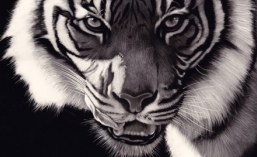
This is the before version

No Fish Today (Small)

And here’s the version with border, frame and glass

No fish today (Small) with frame

First you need an image editing program. I don’t want to stop people buying good programs but I do want to alert people to the fact that there’s a brilliant one available which will do basically everything that the best programs will do, free of charge. Get Gimp here http://www.gimp.org/downloads/

Follow the setup instructions and when it launches, it will look like this (this is current as at writing but will be subject to upgrades). Three windows will open up the first time. One is the toolbox, one is the layers box and one is the image container.

Gimp frames 01 (Small)

As you can see, I’ve already gone to open an image file in the menu in the image box

Now with the image open, go to Filters/Decor/Add Border

Gimp frames 02 (Small)

Another box will open up called Script-Fu: Add Border. This is where you can play with the settings.

Gimp frames 03 (Small)

The first thing I’m going to do is create a mount. In this case I’m setting the x and y border sizes of the mount (the width that the mount will become) at 100 pixels and I’m going to set the colour to white. The width of the border and/or frame will vary depending on how large your picture file size is to start with. My picture in this case has been reduced to 800 pixels high x 435 wide. To set the colour, click on the colour bar and you’ll be able to put your curser wherever you want it in the colour selection panel, or if you want white, just type into the HTML box the code for white, which is ffffff

Now you need to reduce the delta value on colour to 1 (I’ll tell you why later). Click ok and you’ll have a white mount around your picture. I stretch the edges of the picture or maximise it so I can see the border.

Now we want to put a frame around it. Open the add border box up again and reduce the x and y borders to whatever size you want. In this case, I’ve used 50 (which will be the width of the frame), change the colour to what you want (I’m going for a nice grey here and have typed a grey code in of 646464, but you can also click inside the colour selector to get whatever you want). Whatever code the colour comes up at, write it down for later.

You now need to change the delta value, in this case I’ve gone to 40. This is what makes the border look like a frame, giving you the frame corners and shading.

Gimp frames 05 (Small)

Click ‘ok’ and you’ll have a nice frame around the border.

Gimp frames 06 (Small)

This next stage can shape the frame a little. It doesn’t make a massive difference but you could try it to see if you want it. Go to Filters/Decor/Add Bevel

Gimp frames 07 (Small)

and a dialog box will come up where you can set the ‘thickness’ to the maximum 30

Gimp frames 08 (Small)

Click ‘ok’

Now that you have your border and a nicely shaped frame, you might want to make it appear as if it’s behind glass. This can be achieved by going to Filters/Light and Shadow/Xach-Effect. A box will open and you can leave all the settings at the default level and click ‘ok’.

Gimp frames 09 (Small)

Your frame will now have a shadow that makes it look like there is glass in it

Gimp frames 10 (Small)

Now, with the settings for Xach-Effect left at default level, you will notice that your frame is lighter than before. If you want it to stay the same colour, use the code you wrote down when you created the frame, click on the box that says “Highlight Colour” and put that code into the field called “HTML Notation”. This will stop the frame from going lighter.

If you are ever unhappy with a choice, you can go to Edit/Undo. With Gimp there is a limitless ‘undo’ range.

If you want to not only create this ‘glass’ look but also want a shadow behind the frame as if it were hung on a wall, instead of using the Xach-Effect, you could use the “Drop Shadow” effect which is also in Filters/Light and Shadow. Again, just use the default settings but here, your frame won’t change colour.

Here’s an example. I’m not a fan of this one as the background seems to stay white and as you can see, that might look good on a white page but not on a page of any other colour. Great for putting in documents like ‘Word’ for example

Gimp frames 12 (Small)

Now it comes time to save your picture. In fact, I suggest saving your picture regularly whilst you are editing just in case your computer stalls. I always suggest this, no matter what you are working on. Go to File/Save as and type the name you want. If you save it now, this new version of Gimp will give your file an ‘xcf’ format automatically. This is a great format as all changes are saved in layers and you can edit it at a later date. However, you will also need to save it in a regular picture format too, so go to ‘save as’ again and change the xcf (after the dot) to jpg. It will then tell you to export it and then you can set the quality. By default it comes up as 85%. I just slide this up to 100%.

Using the above principles, it is possible to create other effects such as double mounts of different colours, bevel edged mounts, (notice with my gorilla I’ve put a border around the image so the white part of the image doesn’t get lost in the white mount) etc etc. Here’s an example with a few borders. I probably wouldn’t use these colours in a frame but they are there to show you the possibilities.

Old Man (Medium) test

I hope this has been of use to someone.

Coloured Scratchboard

In my last post I talked about the black scratchboard. I often end up colouring over the scratches but here’s a different concept where all the colour is going to be provided by the artist.

Here we have a Bornean Orangutan and I’ll show you some steps below.

Orangutan (4) finished

I used a small Ampersand Claybord for this. They come with white already sprayed on the surface of the underlying kaolin clay and unlike many brands, their white ink isn’t too shiny and can take colour in the form of coloured pencils. You could use inks or acrylic paints and even watercolours but I will say that acrylics can be added too thickly and make it difficult to scratch through, and watercolours can smear a bit when you put on another layer, so be careful.

After transferring my drawing to the board I waded in with coloured pencils just to get the feel of the piece.

Orangutan

I also added some black ink on the animal’s left cheek by using a fibre-tipped pen, and started scratching some of that out with a craft knife and continued this process below.

Orangutan (1)

We are going through what I call the ‘ugly’ stage here but it’s a case of just persevering with it, keep adding colour and keep scratching back, sometimes using a few layers. Always make certain you allow the area to dry before you scratch it again as the clay may come out in clumps (unless you wish to experiment for effect).

Orangutan (2)

I’ve started to try to deepen some of the colour by using watercolours. I could have used inks and Ampersand make very good ones.

Orangutan (3)

Scratching and colouring and scratching and colouring some more is the perfect way to build up layers and make fur or hair look real. This is where watercolour is ideal as they soak into the ink a tiny bit, but as soon as you scratch, you go through the colour to the white which means you can pick out highlights making some hairs appear on the surface while other hairs appear underneath.

And finally we have the finished scratchboard

Orangutan (4) finished

I hope this has been of help to you.

Scratchboard Art

I currently work in two different mediums, scratchboard and soft pastels. I’m wanting to add oils to this and also have a background in pen and ink, but in this post, I want to concentrate on scratchboards, what they are and how to do them.

If you are English, you’ll probably know them as Scraperboard but for now I’ll refer to them as scatchboards. In America, they drop the ‘a’ to scratchbord and possibly the best manufacturer is a company called Ampersand who have two products, the black ‘Scratchbord’ and the white ‘Claybord’. I’ll try to deal with ‘Scratchbord’ in this blog and ‘Claybord’ later.

Scratchboards (generic term) are manufactured by taking a hardboard sheet (like general hardware store MDF) and covering it in a fine layer of white kaolin clay, and then spraying that with ink, black in the case of ‘scratchbord’ and white in  ‘claybord’. You can use various tools to scratch the ink off to reveal the white clay, which you can colour with a variety of media.

Let’s start this demonstration with the black boards using these two pieces as examples.

“Watchful” 

Lion Zambia (Small)

“The Elder Statesman”

African Man finished (Small)

I’ve used these two finished pieces to show that scratchboard can be used for all kinds of textures. They can even be used for landscapes or abstracts, so it’s a versatile medium.

I generally draw my design on a piece of paper the same size as the board I’m going to be using, and once I’m happy that all the elements are in the right place, compositionally and proportionally speaking, I transfer the drawing to the board with transfer or tracing paper.

For an example like my “Elder Statesman” above, I’ve used a craft knife and a fibreglass brush, both show below

Scratch tool

14259

These are the two tools I’ve used here but I’ve also used nail files, steel wool, sandpaper and brass brushes in other pieces.

The fibreglass brush has been used to quickly clear the black ink from the background. A serendipity here is that as I was doing it, I liked the halo effect I got so I left the background like that on purpose. I used the craft knife to scratch the ink away in a cross hatching style and then used the fibreglass brush to fade the ink away a bit, especially in the highlight areas. This is an earler shot and a closeup to show the effect I mean and you’ll be able to see the process around the chin.

African_Man003 (Small)

African_Man_mouth (Small)

Scratchboard is a particularly good medium for renduring hair or fur and for the lion, I’ve used the same tools in a slightly different way, always trying to scratch in the direction of the fur. This creates the illusion of hair and helps show the form of the animal’s structure under that hair. Here are a few images showing the progress of the piece and a couple of closeups showing the direction of the fur and how I’ve done the eyes with a ‘stippling’ technique which involves bouncing the tip of the knife on the board which flicks off a tiny piece of clay with each bounce.

Lion_01 (Small)

Lion_03 (Small)

Lion_03_mouth_crop (Small)

Lion_03_eye_crop (Small)

Back to the original image, I’ve created the swirls of fur in the shadow behind the head using the brush, following the fur direction carefully, and then washed some diluted black ink over the result to keep the shadows.

Lion Zambia (Small)

There are many ways to create texture with a knife. In the man above, I used the cross hatching technique but in the man and chimp below, I’ve used what I call my ‘squiggly’ technique where I scratch in a random fashion to create the highlights

“Abu”

Chimp Abu (Small)

“No Fish Today”

No Fish Today (Small)

Here’s a closeup to show you that ‘squiggly’ technique which can be quite effective when not magnified like this.

No_fish_today_eye (Small)

With my next post, I’ll tackle colouring the white boards (‘Claybord’)

I hope this has been of use to you.