New article by me in Artists’ Palette magazine

Artists’ Palette magazine is an excellent source of inspiration so it’s a great honour to be included in the edition currently in the shops, issue #105. I have sixteen artworks published plus a demonstration of a zebra scratchboard. Also, there are four artworks by my dad in there. He was a huge inspiration to me and, despite losing him when I was thirteen, he showed me the way in life. His art was gorgeous and always represented those African animals that he loved so much. Below are a couple of pages from the magazine article including the page with the four pieces my dad did.

Below is the start of the demo of “Wall of Stripes”

If you go to the menu above, “About Me” and then “Publications”, I will be putting up a montage of the whole article.

Happy New Year to you all 🙂

President’s Award and Most Popular Piece 2011

I have to admit I am totally surprised and extremely pleased to have won The President’s Award for 2011 in the Wildlife Art Society of Australasia. It’s even more amazing considering the wealth of talent and superb art entered into the same shows I was in. I also won ‘Most Popular’ piece at the Bundoora Historic Homestead “The Art of Wildlife” show for my montage of emus, “The Birdy Bunch” pictured below. This was a fun piece to work on, finding such different ‘personalities’ in emus without turning them into caricatures, but simply showing them as they are in their many guises. It was also fun gathering reference material whilst constantly feeling they would peck my eyes out!

Following guidelines for Jury process

Hi guys, this post is for people who don’t know how to follow the guidelines of societies or exhibitions who stipulate certain requirements in their application procedures because sometimes computers can scare people. I’ve tried to break down some guidlines into simple, easy to learn steps.

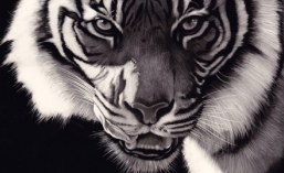
Number one, if a society or exhibition asks you to name your images a certain way, they have a reason for doing so. Please follow those guidelines to the letter and things will go smoothly. In the case of the International Society of Scratchboard Artists, if I were to apply for active membership status I would notice that the requirements call for my zebra piece to be titled the following way

HedgesPatrick-LifebloodofEtosha-16×20.jpg

The reason for this is so that we never mix up an image from one applicant with another. We need the name, title and size so the jury can do its job. Any organisation can (and often will) dismiss an application with no refund if the guidelines are not followed.

Tip. Read the guidelines carefully, no matter which society or exhibition you are applying to.

Number Two

Not everyone knows how to resize an image. I have shown guidelines below to follow for resizing images in three different programs that you might have or are able to install on your computer for free, and following those three Cathy Sheeter has written one for Photoshop.

Note, this tutorial was written in November 2011. Programs change over time and elements may change but generally these instructions will allow you to work your way through newer programs or updates.

—————————————

Firstly, Picture Manager. This program comes bundled with Microsoft Office so most people have it. If you don’t have “Office”, go to my next program.

Open your picture in Picture Manager. If Windows doesn’t do this automatically (by ‘default’), locate your image in Windows Explorer, hover your mouse over the image and do a right click. A dialog box will open and you can go to “Open With” and then click “Microsoft Office Picture Manager”.

You will now see something like this so click on “Edit Pictures” and then go to the right and click on “Resize”.

Put a dot in “Percentage of original width:height” and reduce this until it is about 1000 pixels on the longest side. You will see the pixels changing where it says “New size”.

Click “OK”.

Now, very important for your own sake, save your image by going to “File” and “Save As”. Call it by the name you need to in the guidelines. Then click “Save”

Now you will want to close your image. Click the “X” at the top right and you will be asked again if you want to save your image – DO NOT SAVE IT. This is your orginal image at the original larger size, and you will want to keep that for your own records. If you click “Save” at this point, you will lose your original file and that is not something you want to do. (I know this by bitter experience).

—————————————

I have also installed “Gimp” on my computer. This is a free image manipulation program a bit like Photoshop. Get it, it’s free and very powerful (unless you have Photoshop). You can get it from here

So, open up Gimp and it will look like this (igonore my zebras in the first picture, they are just on my desktop )

Click “File” and then “Open” and navigate to the image you want.

Go to “Image” and then “Scale Image”

Type 1000 into the longest side (if yours is a landscape like my zebras, do it in “width”). Don’t bother with the other side as Gimp will do that for you. Then click “Scale”

Then go to “File” and “Save As” and save it as the name you need to call it. Make certain it says .jpg after the file name.

You will be able to exit this directly as Gimp keeps your original image.

If you need to save your image below a certain amount of kilobytes, when you do a “save as” with a jpg image, it should give you the option to change the ‘quality’ setting in percentage. By lowering that number it will reduce your file size. Experiment and you will get your image below the required size while still keeping the pixels correct as in the previous steps. To find out how many kilobytes your image is, hover your mouse over your image in Windows Explorer and a dialog box will come up and tell you the size. You could also ‘right click’ and go to ‘properties’.

—————————————

Finally, I also have a program called Light Image Resizer 4 which allows you to save multiple images at once to a predetermined size, very useful. It’s free and you can get it here

Open it and it will look like this

Click “continue” unless you want to buy their pro version.

Navigate to your image and open it.

Like I said, you could re-size quite a few images at once if they are all in the same folder.

Where it says “width” and “height”, type in 1000 in both boxes. This will keep the longest side to 1000 pixels and the other will reduce accordingly. Make certain it says “Create Copies” next to ‘action’. This will keep your original files. Click “Process” and “Save”

Close your program

Important!! Go to your image in something like Windows Explorer or whatever you use to navigate to your pictures. You will notice your original is still there but you have another image alongside it at the reduced size. Change the name of this one to whatever is required for the society or exhibition application procedure.

There, three different ways to get your images to the right size.

Above all, follow the jury requirements. This is not ISSA being precious, these are tips to make your passage into any society or exhibition easier as some are extremely tough.

—————————————

And finally, if you have Photoshop installed, my friend Cathy Sheeter has written this tutorial to resize in that program – thanks to Cathy

This is Adobe Photoshop CS 5, but the previous versions and adobe elements should be pretty similar.

Open your large file

Under the heading of image will be something that says Image Size

Change the longer of either width or height (depending on your image) to the required size. If the prospectus tells you that the image must be a certain dpi (72, 100 or 300 are somewhat common) change the area in pink to that number first, then adjust the pixels above. Make sure that “Scale Styles” is clicked so that the ratio of the image does not change.

Once resized do a “Save As” so you do not over-write the original file with the new smaller one (you might need the larger image again in the future). When you do the ‘save as’ re-name the file in the required layout – for ISSA is would be SheeterCathy-Beemused-24×25.jpg When you go to close the image it will ask if you want to save it and hit NO this time.

THIRD THING
If you realize that you have made a mistake on either naming or sizing shortly after you submit to the show write to the contact person, apologise for your mistake and ask them if there is a way for you to re-sumbit your images with the mistakes corrected. If you are polite and notice your mistakes before a deadline many shows will let you re-submit your images so that they may be considered for the show or jury. If you do NOT notice your mistakes most often your images will be discarded without consideration!

If you need to save your image below a certain amount of kilobytes, when you do a “save as” it should give you the option to change the ‘quality’ setting. By lowering that number it will reduce your file size. Anything over quality 6 should give an image that is fine for viewing without much loss in quality.

Creating a winning image

I’ve often been told that I seem to be able to show the ‘soul’ of my subjects through my art and though I’ve never really known why this is so, I thought it might be useful for anyone reading, and also myself, to put down in this blog my thoughts on how I come about creating an image, whichever medium I use.

1. Generally I work from my own references, photographs and experiences collected from my travels around the world. I prefer this as it becomes more personal. I understand that not everyone has had the ability to go and get all their own reference material but it is something I encourage you to try to do. It’s certainly worth it in the long run.

Himba lady from Namibia.

2. I never create a piece of art unless I am personally and emotionally touched by the subject. I will not accept a commission unless I feel like I can immerse my own personality into it. If someone gives me a photograph of their dog and tells me that they want that animal copied, if that photograph doesn’t resonate with me, I will reject the commission. Here’s one I did where the owner sent me a few photos of her champion Collie and I did this commission because she had spent time getting great references and I absolutely adored the dog called Derby

3 Composition. I recently received a commission to do a scratchboard of two lovely daschunds. Although the owner had some very nice photographs, I knew I had to go and meet the dogs and get my own material. I immediately loved the hairy little animals and snapped as many photos as I could. I choose two photographs and edited them into a pleasing composition to come up with the art. One dog cooperated but the other one was camera shy. I managed to get a photo of her hiding behind the owner’s legs and edited that so that it looks like she was sitting behind the other dog. The dog on our right had to be adjusted for light source obviously and I feel that the image was successful

More on composition and content. I try to use the rules of thirds. That means I put the points of interest on one of the thirds in the picture. If you see a great photograph of a beach scene, you will never see the horizon, or the palm tree, in the middle. If you did, it simply wouldn’t be a great photograph. Let me illustrate my point. Which of the following two pictures is the best?


You will notice on the left (the correct choice I hope) the main points of interest are more or less on thirds. On the left hand vertical third is the bulky shape that is a combination of me and a tree. Nearly on the right hand vertical third is a boat to add interest. On the top horizontal third is the headland and on the bottom horizontal third is the beach/waterline. The water/sky line is close to the halfway point which would be wrong but is not important here because of a) the similar colours of the sky and water and b) the dominance of the headland, which is on the third. Obviously in the right picture, my cropping has ruined many of the aesthetics. All the bulk is in the middle which does not create a harmonious image.

So, extending this theory, let’s look at a closeup of a lion’s eye.

The eye is the focal interest and is on not only the horizontal third, but also the vertical. If you take it further and remove all the fur, you will notice that the eye itself holds these compositional elements with the pupil and reflection on the third.

4. Looking ‘in’ versus looking ‘out’. Most (but not all) of the time you will want to have your subject looking ‘in’ to the picture. In the beach photo I’m on the left looking towards the right. If I was on the left looking to the left, I would be looking ‘out’ of the picture and this would make it less of a settled and harmonious image. I’ve followed this rule with the following picture of my wife’s favourite singer leonard Cohen.

The reason this rule works is it gives the subject some space in front of him/her/it. However, as I said before, it’s not an absolute rule and can be used to your advantage. If you change things around, you can create some tension. I’m going to borrow from my mate Leigh Rust. His image below of a meerkat ‘looking out’ of the picture makes you immediately think not only is the meerkat on the lookout, but that it has perhaps spotted a predator just outside the frame leaving you to guess what has been seen.

Leigh is a fabulous artist. Check his work out on the internet

5. Emotion. People relate to emotion and if you can find some way to include some, you are well on your way to a winning image. The following piece is of a gorilla and is titled “Why?” It’s dangerous to anthropomorphise animals. We often look at a dog and think it is smiling when it’s not. The gorilla is probably calling to mate or may simply be getting ready to stretch, but the pose is perfect to make it seem like the gorilla is asking the question “Why? Why are humans destroying us at such an alarming rate?” This piece of mine has been donated to a group of lawyers who advocate the rights of animals. You will notice I’m following my compositional rules too.

6. Eyes are undoubtably the focal points in most of my pieces. They are known as the ‘windows to our soul’ and can be vital in art. Basically, if you get the eyes wrong, no matter how brilliant your work may be on the rest of the art, you may as well throw the piece away. Badly drawn or misaligned eyes will draw attention and the viewer will move on quickly. If you get the eyes right, there’s a fair chance your image can be very special. Spend time on them because it’s worth it.

There are many more elements to creating a winning image but these are some very important basics to remember every time you put pencil to paper, or brush to canvas (or knife to scratchboard).

Gold Winner at the Wild Awards

I’m a member of that wonderful organisation The Wildlife Art Society of Australasia and recently submitted work into their biennial (once every two years) major art exhibition called the “Wild Awards”. I couldn’t get to the opening but have just been informed that I have won the Gold Award, the major award at the show. I’m absolutely delighted as I was at a recent exhibition run by WASA and the standard of work was brilliant. I walked from piece to piece dragging my jaw along the ground, hoping one day to be as good as the other artists involved, so to have won the major show is a dream come true.

This is the piece I won with. It’s a portrait of the late Abu, the alpha male at Jane Goodall Institute Chimp Eden in South Africa. (Thanks to Theresa Strunk for permission to use the original reference photo). It’s a scratchboard coloured with watercolours and I’ve tried to focus on Abu’s powerful nature.

Thanks to Kris Peter for sending me this photo of my work on the wall.